
 ฝ่ายบริการความรู้ทางวิทยาศาสตร์และเทคโนโลยี (Science and Technology Knowledge Services: STKS) สังกัดสำนักงานกลาง สำนักงานพัฒนาวิทยาศาสตร์และเทคโนโลยีแห่งชาติ (สวทช.) ทำหน้าที่ทั้งห้องสมุดกลาง สวทช. และหน่วยงานบริการเพื่อสังคมความรู้ดิจิทัลแบบเปิด สร้างเวทีแลกเปลี่ยนความรู้ในอินเทอร์เน็ต เพิ่มคุณค่าการวิจัย การเรียนรู้ ขยายบริการสู่สังคมชนบทและผู้ด้อยโอกาส รวมทั้งสร้างและขยายโอกาสบันทึกความรู้วิทยาศาสตร์ในภูมิปัญญาไทยให้ปรากฎแก่ สาธารณะ ทุกคนเข้าถึงความรู้และใช้งานได้โดยสะดวก มีหน้าที่โดยรวม ดังนี้
- จัดทำและดูแลการให้บริการความรู้ด้านวิทยาศาสตร์และเทคโนโลยีให้สอดคล้องกับนโยบายและแผนกลยุทธ์ของ สวทช.
- บริการฐานข้อมูลความรู้ทางวิทยาศาสตร์และเทคโนโลยี รวมถึงบริการห้องสมุดเพื่อสนับสนุนงานวิจัยและพัฒนา
- ออกแบบและพัฒนาสื่อสาระดิจิทัล เช่น คู่มือการใช้งาน การศึกษาผ่านสื่ออิเล็กทรอนิกส์ (e-Learning)
แนวทางการฝึกอบรม แก่โรงเรียน หน่วยงานภาครัฐ และภาคเอกชน - วางแผนและบริหารจัดการฐานข้อมูลความรู้ของ สวทช. ให้เป็นไปตามนโยบายของ สวทช.
- สนับสนุนการบริหารจัดการความรู้ของ สวทช. ด้วยการสนับสนุนกลไกและเครื่องมือต่างๆ อย่างมีประสิทธิภาพและประสิทธิผล
- จัดหาและทำทะเบียนทรัพยากรสารสนเทศสำหรับฐานข้อมูลและห้องสมุด เพื่อให้บริการแก่บุคคลผู้สนใจจากทั้งภายในและภายนอก สวทช.
- ให้บริการงานสารสนเทศดิจิทัลแบบออนไลน์ที่เข้าถึงได้สะดวกจากทั่วทั้ง สวทช. อย่างมีประสิทธิภาพและประสิทธิผล
- สร้างพันธมิตรและเครือข่ายด้านการจัดการความรู้เพื่อส่งเสริมประเทศไทยให้เป็นสังคมแห่งการเรียนรู้
- พัฒนากลไกและขั้นตอนต่างๆ ที่เกี่ยวข้องกับฝ่ายบริการความรู้ทางวิทยาศาสตร์และเทคโนโลยี เพื่อเพิ่มประสิทธิภาพและประสิทธิผลตามที่กำหนดไว้ในข้อตกลงเรื่องระดับการให้บริการ (SLA)
วิสัยทัศน์ (Vision)
ศูนย์รวมความรู้วิทยาศาสตร์และเทคโนโลยีเพื่อบริการแก่ชุมชนวิจัย ผู้สร้างนวัตกรรม และภาคการผลิตในการสร้างขีดความสามารถ และยกระดับศักยภาพวิทยาศาสตร์และเทคโนโลยีของประเทศไทย
 พันธกิจ (Mission)
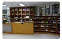
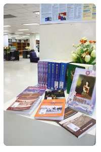
- เป็นห้องสมุดที่มีแหล่งความรู้ทุกรูปแบบของไทยและต่างประเทศที่ทันสมัย ทัดเทียมห้องสมุดระดับสากล
- เป็นศูนย์กลางบริการฐานข้อมูลวิทยาศาสตร์และเทคโนโลยีที่ดีที่สุดของประเทศไทย
- บริการทรัพยากรสารสนเทศดิจิทัลแบบออนไลน์ที่เข้าถึงได้สะดวก โดยไม่จำกัดสถานที่ บุคคล และเวลา
- สร้างพันธมิตรการจัดการองค์ความรู้ เพื่อก้าวสู่สังคมแห่งภูมิปัญญาและการเรียนรู้
โครงสร้างตามสายงาน
♦ งานบริการและจัดการความรู้ (Knowledge Management and Services : KMS)
- ให้บริการฐานข้อมูลความรู้และห้องสมุดด้านวิทยาศาสตร์และเทคโนโลยี เพื่อสนับสนุนการทำวิจัยและพัฒนา
- จัดหาและลงทะเบียนทรัพยากรสารสนเทศสำหรับฐานข้อมูลและห้องสมุด เพื่อให้บริการแก่ผู้ที่สนใจจากทั้งภายในและภายนอก สวทช.
- ให้บริการสารสนเทศวิทยาศาสตร์และเทคโนโลยี โดยเฉพาะสารสนเทศเพื่อการวิจัยและพัฒนา
- ส่งเสริมทักษะการใช้ทรัพยากรสารสนเทศอิเล็กทรอนิกส์ เพื่อบริการภายใน สวทช. รวมถึงเครือข่ายกระทรวงการอุดมศึกษา วิทยาศาสตร์ วิจัยและนวัตกรรม
- จัดทำและปรับปรุงข้อมูลบรรณานุกรมให้ทันสมัยอยู่เสมอ
- ช่วยเหลือผู้ใช้บริการในการจัดทำแหล่งจัดเก็บทรัพยากรสารสนเทศ ข้อมูลเส้นทาง และการอ้างอิงต่างๆ อย่างเหมาะสม
- บริหารจัดการฐานข้อมูลความรู้ของ สวทช. ให้สอดคล้องกับนโยบายของ สวทช.
- พัฒนากลไกและเครื่องมือเพื่อสนับสนุนการจัดการองค์ความรู้ของ สวทช.
- อำนวยความสะดวกในการเผยแพร่ความรู้และประชาสัมพันธ์ผลงานวิจัยและความสำเร็จของนักวิจัย
- อัพโหลดข้อมูลเก็บไว้ในระบบแชร์ข้อมูล และระบบ "My Performance" ของ สวทช. และปรับปรุงข้อมูลให้มีความทันสมัย
- ให้บริการซอฟต์แวร์และฮาร์ดแวร์ที่เกี่ยวข้องกับการจัดการองค์ความรู้ โดยเฉพาะที่เกี่ยวข้องกับระบบ "myPerformance"
- พัฒนากลไกและขั้นตอนต่างๆ ที่เกี่ยวข้องกับงานบริการและจัดการความรู้เพื่อเพิ่มประสิทธิภาพและประสิทธิผลตามที่กำหนดไว้ในข้อตกลงเรื่องระดับการให้บริการ (SLA)
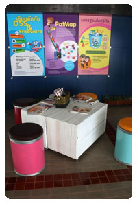
♦ งานพัฒนาและบริการสื่อสาระดิจิทัล (Digital Content Development and Services)
- ออกแบบและพัฒนาสื่อสาระดิจิทัล เช่น คู่มือแนะนำต่างๆ การศึกษาผ่านสื่ออิเล็กทรอนิกส์ (e-Learning)
แนวทางการฝึกอบรม แก่โรงเรียน หน่วยงานภาครัฐ และภาคเอกชน - ศึกษา วิเคราะห์ และพัฒนาเทคโนโลยีทั้งฮาร์ดแวร์และซอฟต์แวร์ตามความเหมาะสม เพื่อใช้ในการเพิ่มพูนความรู้
- บริการที่ปรึกษาในด้านสื่อสาระดิจิทัล
- บริหารจัดการห้องสมุดดิจิทัลให้มีความทันสมัย
- พัฒนากลไกและขั้นตอนต่างๆ ที่เกี่ยวข้องกับงานงานพัฒนาและบริการสื่อสาระดิจิทัลเพื่อเพิ่มประสิทธิภาพและประสิทธิผลตามที่กำหนดไว้ในข้อตกลงเรื่องระดับการให้บริการ(SLA)